Navigating and customizing a Memento generated app
Navigating and customizing a Memento generated app
- Setup
- App entry point
- Onboarding flow
- Replacing the Onboarding flow screen
- Card screen
- Replacing the Card screen
- Conclusion
Setup
If you don't have a project set up. You can generate a new project with the Memento CLI via the command:
memento init
For full documentation on how to get started with the Memento CLI, see:
App entry point
Like any other ReactNative app, the project has an entry point in the App.tsx file.
In App.tsx, everything is inside a <MementoContainer/> component. And event handling is done from its action prop.
The generated app demonstrates how to handle the login flow:
<MementoContainer
  sdk={mpp}
  action={(params: ActionParams, nav: NavigationProp<NavigatorParams>) => {
    if (params.type === 'LOGOUT') {
      setIsLoggedIn(false);
      nav.navigate(RouteNames.AUTHENTICATION);
    } else if (params.type === 'LOGGED_IN') {
      setIsLoggedIn(true);
      nav.navigate(RouteNames.CARDS);
    }
  }}
>
  {isLoggedIn ? AppComp : AuthComp}
</MementoContainer>
Here you can see how login and logout can be handled via the action prop. In this case, we are using the built-in RouteNames.CARDS route along with the Card screen (<Cards />).
See the definition of the AppComp:
export const AppComp = (
  <>
    <Cards name={RouteNames.CARDS} />
    <SettingsMenu name={RouteNames.SETTINGS} />
  </>
);
In AppComp there are three things to take note of:
- The Card screen (
<Cards />) - The whitelabel screen we provide for a more low code approach. We will cover this component and how to replace it in more detail later in this article. (Card screen and Replacing the Card screen) - AppComp is a fragment (
<>...</>) - This is very important as all of the children in<MementoContainer>...</MementoContainer>need to represent a Route and have a uniquenameprop set. - SettingsMenu - This component is needed by the Card screen (
<Cards />). It has a button to show App settings.
Onboarding flow
You might've noticed that the generated app switches between two sets of fragments based on whether or not the user is logged in. AppComp when a user is logged in and AuthComp when he's not.
We've already covered the AppComp, so take a closer look at AuthComp:
export const AuthComp = (
  <>
    <Authentication name={RouteNames.AUTHENTICATION} />
    <SignUp name={RouteNames.SIGN_UP} />
    <SignIn name={RouteNames.SIGN_IN} />
    <KYC name={RouteNames.KYC} />
    <KYCstatus name={RouteNames.KYC_STATUS} />
  </>
);
Similar to the AppComp component, we have a main route in
<Authentication ... />
and then subroutes:
SignUp, SignIn, KYC, KYCstatus.
Currently, all of these subroutes are needed for Authentication to work properly.
Replacing the Onboarding flow
Currently, all elements of the <Authentication ... /> component is fixed. But our short-term roadmap includes features that would allow for customizing their order via the Memento dashboard.
Alternatively, you could create your own UI for the onboarding flow using our JS API SDK
See also:
REST API Onboarding flow documentation
Card screen
As previously stated in this article we are navigating to the <Cards/> component by default upon logging in.
The Card screen is a whitelabel screen Memento provides through the RN-Memento-SDK to provide a low/no code solution for Memento's clients, if you want to use the Card screen mostly as is.
Please refer to these articles on how to customize the Card screen to your needs:
Replacing the Card screen
Let's look at the AppComp component again:
export const AppComp = (
  <>
    <Cards name={RouteNames.CARDS} />
    <SettingsMenu name={RouteNames.SETTINGS} />
  </>
);
The Cards route, along with its subroute, SettingsMenu, could be replaced by a custom route.
A route is nothing more than a React component with a route name name as a mandatory prop.
import { useSignOutUser } from '@mementopayments/rn-memento-sdk/library/src/api/onboarding/useSignOutUser';
import { useCardSummaryData } from '@mementopayments/rn-memento-sdk/library/src/cards/hooks/useCardSummaryData';
import { useCardTransactionData } from '@mementopayments/rn-memento-sdk/library/src/cards/hooks/useTransactionData';
import { LOGOUT } from '@mementopayments/rn-memento-sdk/library/src/state/auth/types';
import { useDispatch } from '@mementopayments/rn-memento-sdk/library/src/state/context';

// ...

const MyCustomLoggedInComponent = (props: { name: string }) => {
  const { signOut } = useSignOutUser();
  const dispatch = useDispatch();

  const summaryData = useCardSummaryData();
  const transactionData = useCardTransactionData();

  const cardData = { summaryData, transactionData };

  return (
    <View style={{ alignItems: 'center', justifyContent: 'center' }}>
      <Text>I AM LOGGED IN</Text>
      <Text>{JSON.stringify(cardData)}</Text>
      <Button
        title="LOG OUT"
        onPress={() => {
          signOut().then(() => {
            dispatch({ type: LOGOUT });
          });
        }}
      />
    </View>
  );
};
And AppComp could look like this:
export const AppComp = (
  <>
    <MyCustomLoggedInComponent name="MyCustomLoggedInComponent" />
  </>
);
And the action in would navigate to our new route's name:
<MementoContainer
  sdk={mpp}
  action={(params: ActionParams, nav: NavigationProp<NavigatorParams>) => {
    if (params.type === 'LOGOUT') {
      setIsLoggedIn(false);
      nav.navigate(RouteNames.AUTHENTICATION);
    } else if (params.type === 'LOGGED_IN') {
      setIsLoggedIn(true);
      nav.navigate('MyCustomLoggedInComponent');
    }
  }}
>
  {isLoggedIn ? AppComp : AuthComp}
</MementoContainer>
Adding custom elements to the Card screen
The <Cards /> component supports adding custom components before/after and in-between the Cards screen's components, as well as custom header and footer for the screen.
By default the <Cards /> will return our recommended setup, which includes:
- A screen header with a way of navigating to the Settings screen, as well as a title of your card/funding-source
- <Card.Summary /> component
- <Card.TransactionList /> component
- No footer
You can customize this and use your own components here by switching to define this via Cards' child components.
<Cards
  header={<MyCustomHeader /> /*<></> for no header*/}
  footer={<MyCustomFooter />}
>
  <Cards.Summary />
  {/*To remove this element simply remove this from the children list */}
  <View style={{ alignItems: 'center', height: 44 }}>
    <Text>My custom component</Text>
  </View>
  <Cards.TransactionList />
</Cards>
Replacing the Card screen modals
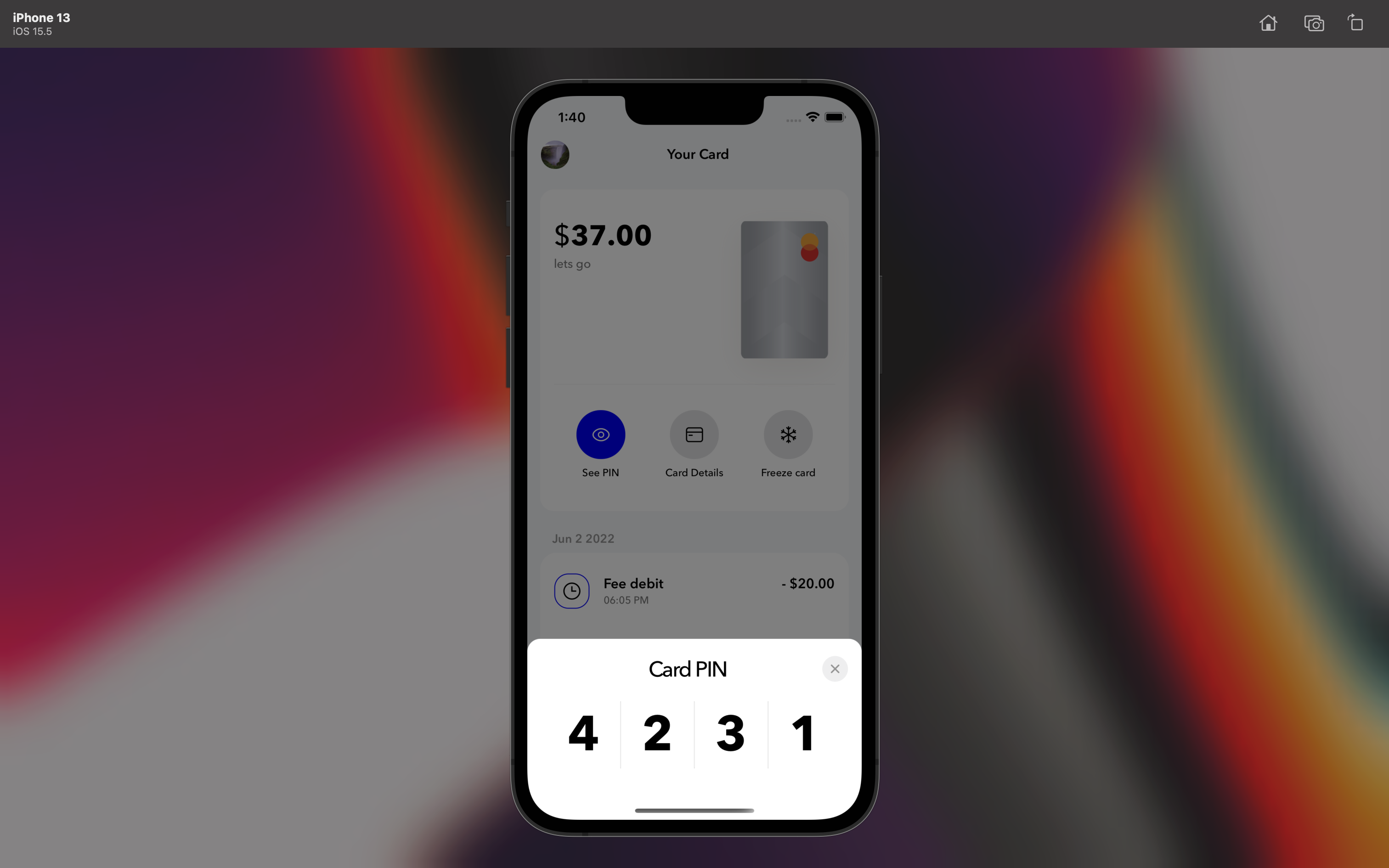
If you look at the Card screen as it's generated via the Memento CLI, you'll notice that it has a lot of useful modals, such as:
- Card pin modal
- Card details modal
- Freeze/unfreeze card modal
Example: The Card Pin modal
Showing the modals in your custom components
You can get this functionality quite easily by simply using the useModals hook.
NOTE: This can only be used in components that are descendants of MementoContainer in App.tsx
const {
  isPinModalActive,
  togglePinModal,
  hidePinModal,

  isCardDetailsModalActive,
  toggleCardDetailsModal,
  hideCardDetailsModal,

  isFreezeModalActive,
  toggleFreezeModal,
  hideFreezeModal,

  closeAllModals,
} = useModals();

// ...
togglePinModal();

// ...
toggleCardDetailsModal(cardData.cards[0].name);

// ...
toggleFreezeModal(cardData.cards[0].name);
Conclusion
That's it! 🎉
Happy coding everyone 💅
Updated about 1 year ago